Friday 5 February 2021

Memes, Multiple Finished Foams, Glass table top

And another month of solitude passes by… The Instagram residency we did with Orbit was fun. People seemed to enjoy the memes we made and it felt good to talk frankly about how we make stuff. All in all a worthwhile experience for both us and audience. Below is the selection of memes we made.


These final couple weeks of furlough, combined with having a physical project to get on with, has meant being in the studio most days. The large foam insert for the point of view gun has now been finished and photographed. Very pleased with how this one has turned out; feels quite strange to have been so part of the physical making process but since it’s made everything a lot cheaper it’s felt pretty good.


Also finished making the full edition of the smaller foam inserts. Very repetitive work but also very satisfying seeing them all done. Just need to hope they sell now…


We’ve finally started (and kind of finished) the glass table top work. Been at least a year in the making but hopefully it’s the first in a potential series involving mapping/tracking tabletop movements in particular film scenes. This one is from a clip in Layer Cake where the characters are discussing the next move after a violent incident. Everything in film is planned, even seemingly insubstantial movements are meticulously planned and scrutinised over in order to apply meaning. Just need to get some L hooks to hang it on the wall.

Monday 18 January 2021

Gallery Dodo Update, Paper Festival Update, Bookmark Edition, Orbit Instagram Residency

New year new us. We’ve had some updates on the Brighton show, the first being that it’s most likely going to be pushed back about a month. For us, this doesn’t really change anything as we’re not that busy due to the big c. It might mean that Scott is able to attend the show which would be nice since we haven’t actually met in person. In terms of the actual work, the foam for the yellow piece has arrived and looks great. We ordered 5 again as it’s cheaper than ordering them one at a time but we didn’t realise how large they actually are. With the smaller ones they make good gifts but giving one of these away would be quite imposing. We’ll find somewhere for them I’m sure!


The two new paintings have been put into production and once they’re completed all the works will be done. We were going to have 2 which are landscape orientated but realised that all the other work is landscape too, so went with some more recently portrait one’s we had made. One is for Ronnie Rocket, an unrealised film by David Lynch which has a great story. After finishing Eraserhead, David Lynch spent two years writing a script for a new project entitled, Ronnie Rocket. He met with one film studio, describing the film to them as being "about electricity and a three-foot guy with red hair"; the studio never got in touch again.

Lynch then met Stuart Cornfeld during this time. Cornfeld had enjoyed Eraserhead and was interested in producing Ronnie Rocket; Cornfeld was working for Mel Brooks and Brooksfilms at the time, and when the two realized that Ronnie Rocket was unlikely to find sufficient financing to be produced, Lynch decided his next project would instead be The Elephant Man.

Lynch would return to Ronnie Rocket after each of his films, intending it at different stages as the follow-up not only to Eraserhead or The Elephant Man, but also Dune, Blue Velvet and Twin Peaks: Fire Walk With Me.

In 1987, after having released Blue Velvet, Lynch once again attempted to pursue Ronnie Rocket. He visited northern England to scout a possible filming location; however, he found that the industrial cities he had hoped to use had become too modernized to fit his intended vision.

The project also suffered setbacks due to the bankruptcy of several potential backers; both Dino De Laurentiis's De Laurentiis Entertainment Group and Francis Ford Coppola's American Zoetrope were attached to the project at different times; both production companies went bankrupt before work could begin.

Due to De Laurentiis owning the rights it ended up in legal limbo for a while following their bankruptcy. Lynch stopped actively pursuing Ronnie Rocket as a viability in the early 1990s. However, he has never officially abandoned the project; frequently referring to it in interviews as "hibernating".


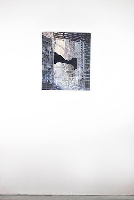
The other matte painting is for Werner Herzog’s unmade film The Conquest of Mexico. Herzog wanted to make a movie about the European colonization of Mexico but from the perspective of the Aztecs.

Francis Ford Coppola tried to produce the movie in the late 1970s but his production company crashed after Coppola's "One From the Heart" flopped in 1982, and he failed to get the $20 million in funding for Herzog. Herzog tried to shop the script around studios in 1996, but without luck. John Milius (screenwriter of Apocalypse Now) was even rumoured to be rewriting the script but this also never came to fruition.

Herzog has been playing with themes of colonialism and conquest throughout his career, and his ideas for this film were eventually disseminated into others. The film lives on through these other works and perhaps the fragments could be pieced together from watching his subsequent movies.


The final update is that we decided on the title, Never seen and yet believed in. It’s slightly inspired by the bible quote 'blessed are those who have not seen and yet have believed', referring to being blessed if you believe without evidence. We enjoy the similarities between ideas at large and religion. Both are things which aren't tangible in their own right but their effect is how they're quantified. It relates to the gaps in our paintings and foam work, plus Scott’s blinking neon. Also, has a good link to Scott’s booklet - artists text trying to convince the world that what they are being is brilliant with words but no physical evidence.

The Paper Festival in Manchester was unfortunately cancelled because of you know what. A real shame but is what it is.


Scott’s invited us to submit a design/artwork that’s going to be screen printed onto a bookmark and sold as an edition. We had a good time thinking up loads of fun ideas and they mostly fell into two groups; recreating things that are used as bookmarks e.g. old shopping lists, and ideas that reference what a bookmark is for – pausing or saving your place in a book. An initial design that we liked was a small corner of the page that looked like it was folded down. It’s a little more design-like than a conceptually driven artwork but it does look satisfying.


We’re going to be partaking in an Instagram Residency at the end of this month with an organisation called Orbit. It’s a great online platform to promote, support, and engage with emerging artists & creatives run by Elizabeth Challinor. We’ve followed previous participants of the residency and have really enjoyed learning more about artists we’re only slightly familiar with. We wanted to do our own version of this and decided that it would be best to focus on us being a collaboration. We’re often asked questions about our collaboration; how does it work? Or who does what? There aren’t set answers to these questions because it differs from project to project but since we’ve been working together for a while now, we’ve refined a system that works for us. The way we work is very beneficial to our practice and we believe it could assist others (especially during this next lock-down) in finding new ways of sharing their initial ideas with fellow artists in an informal setting.

We’re going to open up our collaborative process and show people how we operate. The residency will begin with us sharing our numerous methods of communication ranging from emails, to Facebook messenger, to shared Google Docs. Included in this would be some early works we made together. Following that, we’re going to share a range of current works that are in production, what stage they’re at (some further along than others), and what the next steps are to advance them. Next, a selection of recently completed pieces and finally any upcoming projects. And on the Instagram stories we’re going to share promotional memes that include our website in funny ways.

Monday 21 December 2020

The Noisy Cricket completed


The small gun works arrived! We were very pleased with the cut but we didn’t specify that it shouldn’t go all the way through which means we’ve ended up with a tiny cut out of the gun itself in blue foam. We’ve since had them recut and they look perfect!


Making frames for them was proving difficult; it was far too expensive to get it done exactly how we wanted it or if we got it made less expensively we would have to alter it anyway. Finally, we thought we may as well test trying to make them ourselves; we intend it to be a fairly long series and being able to make them cheaply would be great. It actually went perfectly and we’re really pleased with the result!


The title is Division of Persepctive (The Noisy Cricket). Not sure if we’ve written about the origins of the title before but dividing perspective is a method of showing a 3 dimensional object in 2 dimensional space. This addition of a dimension is exactly what we’re attempting to do with these fictional objects; give them a life beyond the screen, another perspective. 


We’ve just put in the other order for the yellow point of view gun so we’ll most likely receive that in the new year and we’ll start on the frame for that. Then it’s only the two paintings to go and we’ll have prepared everything for the Brighton show! Fingers crossed something else materialises after that…

Thursday 19 November 2020

Gallery Dodo, Bird table, Matte paintings, foam inserts, mirrored tray frame

Going back to work and moving house are just a couple of the reasons for a 5-month break of writing. Still not sure if I’m totally over moving but I’m sure I’ll get there… 

A fun development is that we’ve got a two person (or three depending on how you look at it?) show coming up in March next year. It’s in Brighton in a small space within Phoenix Art Space. It’s being organised by Jon and Dan under their Gallery Dodo brand and there’s a 4 month programme of exhibitions which all look great! Ours is with Scott Robertson who we only knew through Instagram but always really enjoyed his work. His text pencil drawings were the pieces we knew him from (This is just a picture, 2018 was a particular favourite) but we also loved a recent piece where he erased all the markings from a wooden ruler and titled it ‘The Immeasurable’, very thoughtful and clever. 


Anyway, together we’ve come up with an exhibition that centres around the ideas and the moments that surround them. Scott’s going to show a piece called 'The Weight of Another's Words' which is a small pallet loaded up with anything every written about his work but for this show he’s mentioned that he might ask the same writer to add some bits about our work which is super exciting. He’s also going to show a new neon work which we shan’t spoil but we’re very looking forward to seeing it in the flesh. We’re going to show 2 new matte paintings and then the foam insert for the point of view gun. 


Jon and Dan mentioned that there might be a possibility to sell some editions through the Phoenix Gallery website so we’re developing another smaller foam insert piece based on the noisy cricket in Men in Black. Still relates to the exhibition but is smaller/more affordable! It’s really good to have something to work towards after this year feeling like it’s almost stood still… 


In general art-making we’re still battling with how to display the paintings showing the view from portraits; they feel like they need an additional visual push. Something on my mind at the moment is a mirrored tray frame because the work all about looking back into what a subject can see which is what a mirror does; the piece is essentially putting a mirror up to the room that it was in. Another idea was hanging it at the artists eye level but this feels very subtle and could easily be incorporated into the mirrored tray frame if we wanted to. 


In terms of finished artworks there’s quite a few to tick off the production list. We’ve been going back and forth with an idea about The First and Last House (a pub located at the most Southwesterly point in mainland Britain) and all the pieces have finally fallen into place in the form of a bird table built in the style of the pub. As the name suggests, The First and Last House is the first or last house depending on whether you’re arriving or leaving at Land's End, England. The prevailing wind direction of the UK is a southwesterly wind from the Atlantic. This wind is of foremost importance to migrating birds, who prefer to have the wind behind them. The finished work looks good and now lives in Sid’s dads’ garden so hopefully will be enjoyed by some birds!


We’ve also finished the indented note piece and got it properly framed for an exhibition in Manchester. Framed by a excellent framer, artist and all round lovely guy Jack Carvosso – recommend checking out his work if you don’t know him. It was next to impossible to photograph but eventually managed. 


And finally we managed to get the first completed matte painting stretched and shot. Website updates galore!


Monday 29 June 2020

Plinths, Foam, Blind Embossing, Sherlock Holmes


Been making some very slow progress with the missing sculpture plinth. Got another few layers of different colours of paint on and it’s looking a bit better. Still plenty of progress to be made but also just getting to grips with what works best in terms of colours and masking options. It’s definitely going to be a slow burner to be chipped away at when possible. 


Got some quotes back for making the fictional gun foam insert. Some were surprisingly expensive but the more I looked the better it got. The other thing was that the price was significantly reduced when buying a few at a time. Looks like they’re going to be additions of 3 or 4 depending on the size. 


We’ve been thinking more about the display of them and initially be thought they would be good in the Perspex boxes we’ve been making for others works. However, after discussing it a bit further we thought that an aluminium tray frame would be more consistent with the idea. It would also be powder coated to match the grey of a Peli case. We’ve also landed on a title for this series of works; every work will be The Division of Perspective and then in brackets there will be the name of the weapon or tool. Dividing perspective is a method of showing a 3 dimensional object in 2 dimensional space. This addition of a dimension is exactly what we’re attempting to do with these fictional objects; give them a life beyond the screen, another perspective. 
There have been some open calls we’ve been finding and today we saw one for paper artworks to be exhibited at Manchester library and it made us think about a work we’ve had on the list for a while. It’s all to do with writing indentation clues in films; when people write a letter or a note, it's possible that the pressure of their pen or pencil will create indentations not just on the paper they're writing on, but on any paper that's underneath it, too. In some sorts of story (particularly Mystery Fiction, though not exclusively), making use of this fact is a well-established investigative technique. If you want to know what someone wrote on a notepad but the note is no longer there, just look at the next piece, possibly shading it with a pencil to bring out the contrast. 

Writing Indentation Clue - TV Tropes

It’s the invisibility and discovery aspects that really interested us and it reminded us of blind embossing/debossing; a printing technique that doesn't use ink, where you stamp a mark of something into a material, leaving an indentation. We wanted to create a work where a small scrap of paper had something blind embossed onto it but wasn’t scribbled over like in films, it’s still invisible, still waiting to be discovered. After researching further into it, we found that it was mentioned by Sherlock Holmes when telling Watson how he got his information as "a fact that has dissolved many a happy marriage". However, in this case, he uses the blotting paper to obtain the reverse message, as the writer had used a pen. We then decided that we would both use the quote and blotting paper for the piece. In terms of display, the scrap is going to be shown in a white frame, and within a wonkily angled mount. The idea here was that we’re continually adding elements to the piece but since they’re all of the same colour they’re not actually enabling the note to be seen more directly. Usually a frame and a mount are used to point out the object within, but these ones don’t manage that. We’re going to call it You see, but you do not observe, which is another Sherlock Holmes quote.